Report Types
Line Graphs
Line graphs are best used to track changes in data over short and long periods of time. When smaller changes exist, line graphs are better to use than bar graphs. Line graphs are also helpful when comparing changes over a period of time for different pieces of data.


Bar Graphs
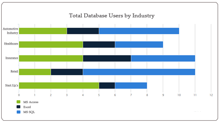
Bar graphs are used to compare different data sets or track changes over a period of time. When trying to measure change over a period of time, bar graphs are best utilized when the changes are large.


Pie Charts
Pie charts are most effective when comparing data as a whole. Rule of thumb when displaying data with a pie chart is that no more than 6 pieces of data should be displayed; anything more than 6 because uninformative and cumbersome.

Area Graphs
Area graphs can be used to track changes over time for one or more data sets. Area graphs are good to use when reviewing the changes in two or more data sets.


Combination Graphs
Combination graphs allow you to combine two or more graph types into one centralized graph. By combining graph types into one, you have the ability to display data sets uniquely and in different viewing formats.


Bubble and Cluster Charts
Bubble charts are used to represent different data values. They are especially useful for data sets with dozens to hundreds of values, or with values that vastly differ.


Map Graphs


Scatter Plots
A scatter plot is one of the most flexible methods for visualizing numeric data. With a scatter plot, you have the ability to visually see the relationship between data sets without having to delve into the detail.


Chord Graphs
A chord graph visualizes relationship dependencies among data sets.

Word Cloud
A word cloud is a visual representation of data in text form. This method of representing data is useful because it’s easy to determine the most prominent terms within your data at just a glance. However, word clouds do not provide trends in data or track changes over a period of time.


“We aim to build things right the first time. You deserve peace of mind, so we guarantee our work. Period.”
- Dan Reynolds, Founder We Build Databases -
Before we write a single line of code, we make sure we understand your data challenges so we can build a solution that meets your specific needs. From the software look and layout to the coding and the framework that supports it.